These videos i really liked, the composition and the 3d elements, are amazing. Hopefully someday i will be able to make something as awesome as this.
The Third & The Seventh by Alex Roman
What is there to say, stunning and breathtaking 3d graphics. I havent seen any of this kind when it comes to detail and colours. Extraordinary if i were to describe it.
F L U X by Candas Sisman
an abstract red ball transforming into different forms.. Great use of lights composition and animation..

Thursday, March 10, 2011

Monday, March 7, 2011
Short films that i like
There have been a few short films that have really struck me, in terms of quirkiness or just the sheer awesomeness of the script and cinematography. Here are some.
A Thousand Words by Ted Chung
I envy people with such great simple ideas, this is one of them. A really simple idea and made into i think a really goodo short film. A silent film at that.
Nuit Blanche by Spy Films
First time i saw this film my jaw dropped. Literally! Amazing 3d animation.. Just amazing.. I showed everyone in class and everyone agreed we will never be this good.
A Thousand Words by Ted Chung
I envy people with such great simple ideas, this is one of them. A really simple idea and made into i think a really goodo short film. A silent film at that.
Nuit Blanche by Spy Films
First time i saw this film my jaw dropped. Literally! Amazing 3d animation.. Just amazing.. I showed everyone in class and everyone agreed we will never be this good.
Some more live action video + Animation
Hershey's - 'Happiness Is...'
Pretty cool integration of video and illustration animation... the animation and video really goes well with the music.
Box Animation by Jordan Clarke
for a while now i have been a fan of Jordan Clarke's work. I like his Style when it comes to his films and short video's. This one is a little bit different with the integration of live video and 3d Animation. He creates these boxes that go with the music. Really fun video.
Pretty cool integration of video and illustration animation... the animation and video really goes well with the music.
Box Animation by Jordan Clarke
for a while now i have been a fan of Jordan Clarke's work. I like his Style when it comes to his films and short video's. This one is a little bit different with the integration of live video and 3d Animation. He creates these boxes that go with the music. Really fun video.
Saturday, March 5, 2011
The Posthuman
I've been researching about what it is to be Post-human and the relationship between man and machine. I've read a few scholarly journals and chose a few good quotes from what i have read.
Wolf, Tom, “Mcluhan’s New World.” The Wilson Quarterly 28, No. 2 (2004) : 18-25.
Hughes, James, Nick Bostrum, Jonathan Moreno, “Human vs Posthuman.” The Hastings Center Report 37, no. 5 (2007) : 4-7.
Hayles, Katherine N. “Refiguring the Posthuman.” Comparative Literature Studies 41, No. 3 (2004) : 311-316.
Wolf, Tom, “Mcluhan’s New World.” The Wilson Quarterly 28, No. 2 (2004) : 18-25.
Evolution used to be measured in units of at least100,000 years. But computer scientist DannyHillis wrote in Wired magazine that thanks to "telephony, computers,and CD-ROMs," today "evolution takes place in microseconds."
God was directing, in this very moment, the 20th century, the evolution of man into a noosphere – that was teilhard de Charding’s coinage, a noosphere – a unification of all nervous systems, all human souls through technology.
Teilhard de Charding died in 1955, when television had only recently come into widespread use and the microchip had not even been invented. Computers were huge machines, big as a suburban living room, that were not yet in assembly-line production. But he was already writing about “the extraordinary network of radio and television communication which already links us all in a sort of ‘etherised’ human consciousness and of “those astonishing electronic computers which enhance the ‘speed of thought’ and pave the way for a revolution in the spere of research.” This technology was creating a “nervous system for humanity,” he wrote, “a single, organized, unbroken membrane over the earth,” a “stupendous thinking machin.” “the age of civilization has ended, and that of one civilization” – he underlined “one civilization” – “is beginning.”
Hughes, James, Nick Bostrum, Jonathan Moreno, “Human vs Posthuman.” The Hastings Center Report 37, no. 5 (2007) : 4-7.
Having the opportunity to be come posthuman canbe good for us in much the same way that
it is good for an infant to have the op- portunityto matureinto an adult.
Hayles, Katherine N. “Refiguring the Posthuman.” Comparative Literature Studies 41, No. 3 (2004) : 311-316.
MarkPoster's"TheInformativeEmpire,"delivered as a keynote addressat the 2003 conference of the American Comparative Literature Association,coins the neologism"humachinet" to mark" an intimate mixing of human and machine that constitutes an interface outside the subject/Objectbinary.
Poster's and Satos arguments converge in implying that information technologies are powerfully affecting contemporary subject formations, moving them away from autonomous individuals and toward posthuman collectivities of humans and intelligent machines.
It is too soon to say where these en- gagements will end. Perhaps the only clear conclusions are that the future of humans will increasingly be entangled with intelligent machines, and that embodiments will still matter in some sense, however virtual or cyborgian they become.
Posthumans are likely to be as complex and diverse, as historically and culturally specific as humans have been. What- ever the future, we can be sure that it will not be simple.
Thursday, March 3, 2011
Initial idea for Storyboard
My first idea for my animation video is using a real person rather than a illustration. Using a voice over of a second person describing the person in the frame.

With the use of text animation on top of the video creating a 3d space within the frame.


With the use of text animation on top of the video creating a 3d space within the frame.

Tuesday, March 1, 2011
Other inspirations
TODOR & PETRU
A video i found Vimeo, with the use of live action video and Animated Illustration.
I really like this one, pretty time consuming when illustration is concerned.
Macro Kingdom
Another Live action video + text animation.
Made by the same person as the last one, Live action video + text animation.
The Crisis of Credit Visualized by Jonathan Jarvis
This video is more text + image animation, no live action footage, but i really like how he got the information across. With the use of simple text and images he was able to get the message across really easily.
A video i found Vimeo, with the use of live action video and Animated Illustration.
I really like this one, pretty time consuming when illustration is concerned.
Macro Kingdom
Another Live action video + text animation.
Made by the same person as the last one, Live action video + text animation.
The Crisis of Credit Visualized by Jonathan Jarvis
This video is more text + image animation, no live action footage, but i really like how he got the information across. With the use of simple text and images he was able to get the message across really easily.
Initial idea for the 1 minute Animation video
Brief 1:
You are to create a short animation (1 minute duration) in response to the POST- HUMAN or your own theme. Your response may be personal, humorous, abstract, analytical, political but it must take a position on the theme – and be backed up with solid research.
My idea came from the opening sequence of the movie Stranger than Fiction done by MK12.
By the use of animated text and images combined with live action video. I intend to use similar techniques on my first assignment.
You are to create a short animation (1 minute duration) in response to the POST- HUMAN or your own theme. Your response may be personal, humorous, abstract, analytical, political but it must take a position on the theme – and be backed up with solid research.
My idea came from the opening sequence of the movie Stranger than Fiction done by MK12.
By the use of animated text and images combined with live action video. I intend to use similar techniques on my first assignment.
Wednesday, October 6, 2010
DEALS DIRECT - ONLINE SHOPPING SITE
 http://www.dealsdirect.com.au/
DealsDirect is an online shopping site based in Australia.
Online shops have a lot of content and usually its hard for the user to find exactly find what he/she's looking for.
- The design is pretty clean.
- A lot of information just in the Home page.
- The use of images in the front page is good, makes it a lot easier for the user.

- The use of drop down menus in the side and top navigation is good.
- It hides a lot of content from the user unless he/she is looking for it.

- Im not sure about having a lot more navigation links in the bottom.
- User might not see the links in the footer area.
 The use of a simple background makes it easy for the user to see the content.
Overall i think this is a good online store. The design is simple, making it easy for the user to use. Its easy even for a first time user.
Design: 8/10
Usability: 9/10
PULP MAGAZINE - MAGAZINE SITE

http://www.pulpmagazinelive.com
PULP Magazine is a music magazine based in Manila, Philippines. Their site promotes local and international artists that come to the Philippines.
- The design of the site is pretty clean.
- Its design looks more like a blog than a magazine site.
- The hierarchy of the content is that of a blog.

- The header looks clean and is easy to understand.
- Good use of text.

- The position of the HOME button doesn't make sense and that the logo is also a Home button.
- If the logo is also a Home button, they should have just discarded the Home button on top.

- Content wise, the Events and Featured pages have the same content, doesn't make sense to make the user go to both pages with almost the same content.


PHOTO PAGE -
- Too much content to scroll down.
- should have separated the content into links.
OVERALL the site is alright. Content is too all over the place, might be hard to find what you're looking for. The design needs fixing, especially the Home button being on top of the logo. The Facebook on the right side and having a live twitter feed works well in the site.
Design: 5/10
Usability: 6/10
DIGITAL DOMAIN - MEDIA DESIGN PRODUCTION
 www.digitaldomain.com
Digital Domain is a big time post production company. They have done big time films including Transformers1, Transformers2, Star Trek, 2012 and GI JOE to name a few.
- Home menu is pretty simple and straight forward.
- Its easy to understand and quick to use.
 - The use of text is simple and big. Easy to read.
- The use of a black background and just text makes the site look very business looking and sleek.
 - The use of icons when watching their work might need a little bit of work.
- some of icons are hard to decipher their meaning.
 - When in the looking at the Feature film > The work, The use of images and rollover animations is very successful.
- The layout is simple yet effective.
 - When clicking any of the films, the next window is still pretty simple.
- The content is straight to the point.
- No non-sense information.
All in all the design is pretty simple yet very sleek. A lot of content yet easily accessible.
Design: 7/10
Usability: 8/10
Tuesday, October 5, 2010
ROCKNROLLA - FILM PROMOTIONAL SITE

http://rocknrolla.warnerbros.com/
The Rocknrolla site has a splash page. One of the things i dont really like.
The main page has a really cool opening animation.
 - The navigation of the home page is fairly easy to understand.
- The rollover buttons for every character is a good way to have interaction in the site.
- Clicking on one of the buttons brings you the another page but the navigation buttons are still present.
- The overall design of the site is excellent.
- Its easy to use and easy to understand.


Over-all i think the design of this site is excellent. Really good use of text, colors, images and interactivity. The interactivity gives the user a direct experience to the film. Usability wise, unlike most sites, it has rollover buttons for each character at the home page which helps alot. Navigation is fairly simple to get around.
Design: 9/10
Usability: 7/10
1st Ave Machine - Personal Choice Site

http://www.1stavemachine.com
A motion graphic design studio based in New York. Pretty simple design.
Video playback as the background.
Home navigation has three buttons, PROJECTS, NEWS and CONTACT.
- User friendly
- Easy to understand
- Its easy to memorize.
- The text might be a little to thin, might be a little hard to read sometimes.
- The background video is a little distracting, but it stops when you view a video from the projects.

PROJECTS
- The background is a distraction especially when playing the videos.

Over-all i think the design is neat and simple. The use of a video instead of a background image tells you exactly from the moment you just opened the site, what the firm is about. In some respects that is a good thing. But when playing the content the background becomes distracting. Usability wise, a really simple site, easy to use and get around.
Design: 6/10
Usability: 9/10
Wednesday, August 18, 2010
Saturday, October 24, 2009
MenuDesign

Menu design
I went with a building design with an animation of splatters of paint then the name of the game CAPTURE THE MONKEY.
Just made two buttons in the scene, the instruction button and the play button.

After pressing the play button, a story sequence will play before the actual game starts.
simple design just fade in fade out text about the story line.

Just for kicks i added a loading animation.

Sunday, October 18, 2009
GAMEPLAY

With the gameplay i wanted to objects around the character to interact with the user when being rolled out and rolled over but there has to be a sequence to finish the game. you have to be near the monkey first before you can drag the banana and be near the cage to drag it.
Saturday, October 10, 2009

Thursday, October 8, 2009
game games games
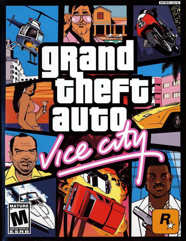
The concept i had for the first project i got the idea from playing GTA vice city, so it's just natural to say that when i was making the gameplay and feel for the game, i had vice city in mind as well.

I play alot of RPG games and one of my most favorite games is final fantasy. i try to incorporate some kind of rpg strategic game play you need to play my game. like having to get something first before you can do another thing.
Friday, September 4, 2009


Subscribe to:
Posts (Atom)